Basic Grid Features
A grid looks somewhat like a spreadsheet because it has rows and columns. It is also referred to as a browser, and sometimes as a scroll box. These are all synonymous words for the same functionality. A grid displays a list of retrieved records.
Double-click an item in any row in the grid to perform one of the following actions:
-
Drill down to item detail. For example, if you double-click a payment item in Payment Inquiry, the A/P Payment Breakdown window appears, and double-clicking a row displays detail for that payment detail.
-
Add or remove the item to/from the grid. In windows where there are Add and Remove buttons and two grids; one for available items and another for selected items, double-click items to add or remove them. For example, in Accounts Payable Payment Reconcile, if you double-click an item in the Available A/P Payment Items grid, the item is added to the Items Selected grid.
Generally, if double-clicking an item does not drill down to item details, there is a separate button for viewing details. You can highlight the row in the grid, and click the button to view details.
You can customize the order of grid columns, by dragging column headers to the left or right. The custom order is saved so that even if you close the window for the grid, you can retain your custom order the next time you reopen the window. If you want to reset all changes you made to grids in all windows, click the Reset Grid Layouts button in the ribbon in Default Options Update.
The following table lists other grid features.
|
Grid Function |
Function |
|
Sorting |
Click any column header and an up arrow appears to signify that the column is sorted in ascending order.
Click the same column header again and a down arrow appears to signify that the column is now sorted in descending order. Note To add multi-column sorting (secondary, tertiary, etc.), hold down the Shift key while clicking other column headers. |
|
Filter |
Click the filter icon at the top of any column to view a drop-down list of all of the possible values in that column. Selecting a filter limits the rows displayed to only those that contain that value. Select any value to filter the column, or select (Custom) to build a custom filter. You can use custom filters to filter a grid by multiple criteria. For example, you could display data for two product categories. |
|
Push Pin |
Click the horizontal push pin icon at the top of any column to keep that column visible (locked) when scrolling to columns to the right. This locked column will be moved to the first column (unless that column is locked as well, then it will be moved to the right of any previously selected locked columns). When a column is locked, the push pin icon appears in a vertical position. Click the push pin icon again to unlock the column. |
|
Shortcut Menu |
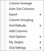
Right-click a grid to access these options: |
|
Grid Splitting |
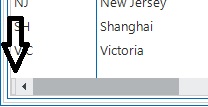
To the far left of the horizontal scroll bar, click and drag the small vertical bar to the right. This will split the grid into 2 sections.
|


